OPENHOUSE
Openhouse is a biannual magazine with subjects ranging from art, design, architecture, and culture. The redesign mission is to encourage an informal dialogue between the reader and the content curated within the magazine—conversing in the exchange of ideas that bring voice, authenticity, narrative storytelling, and an expression of identity within the community of avid readers.
Scope
Visual Identity
Brand
Openhouse
Project
Personal
Role
Designer
I.
Logo
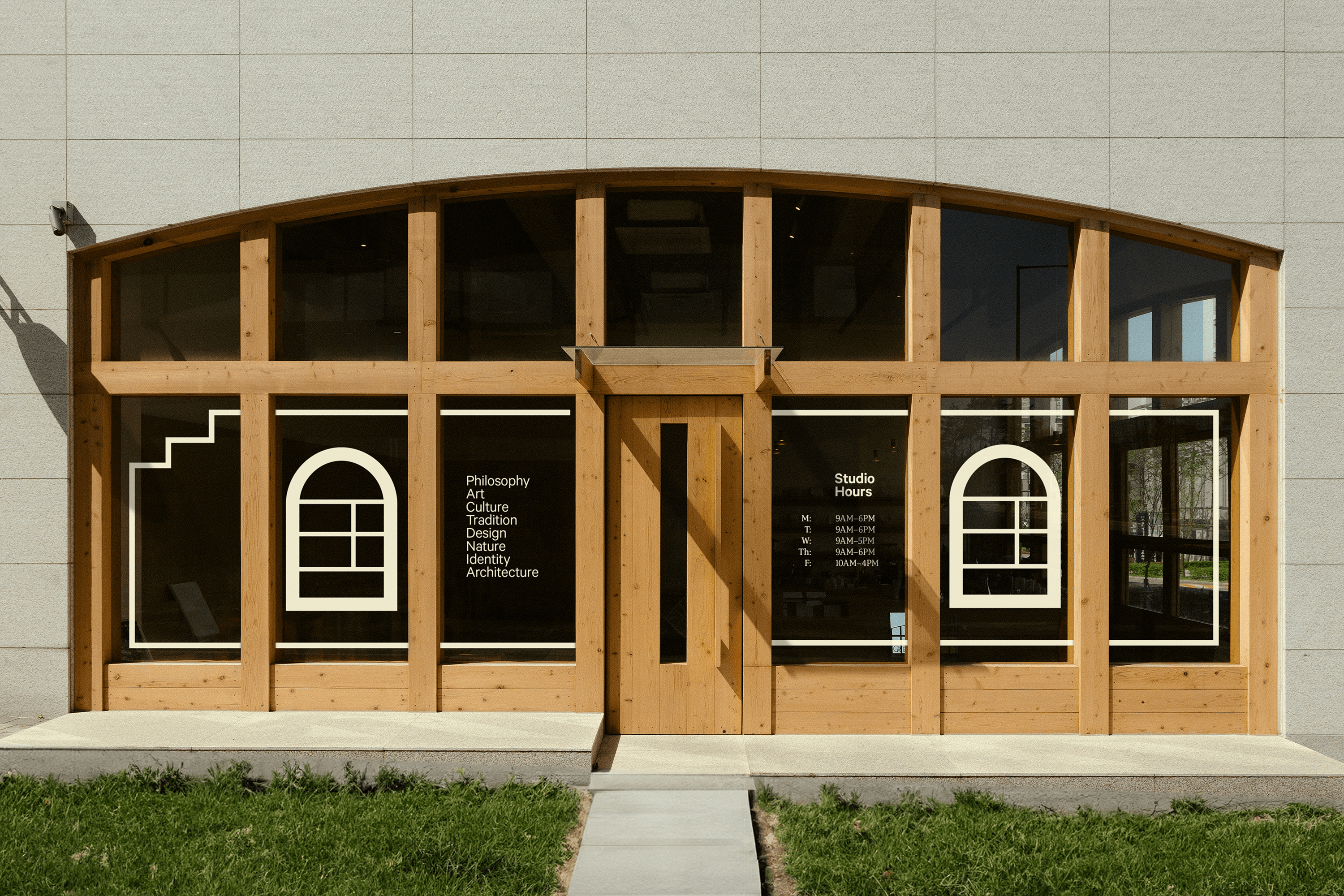
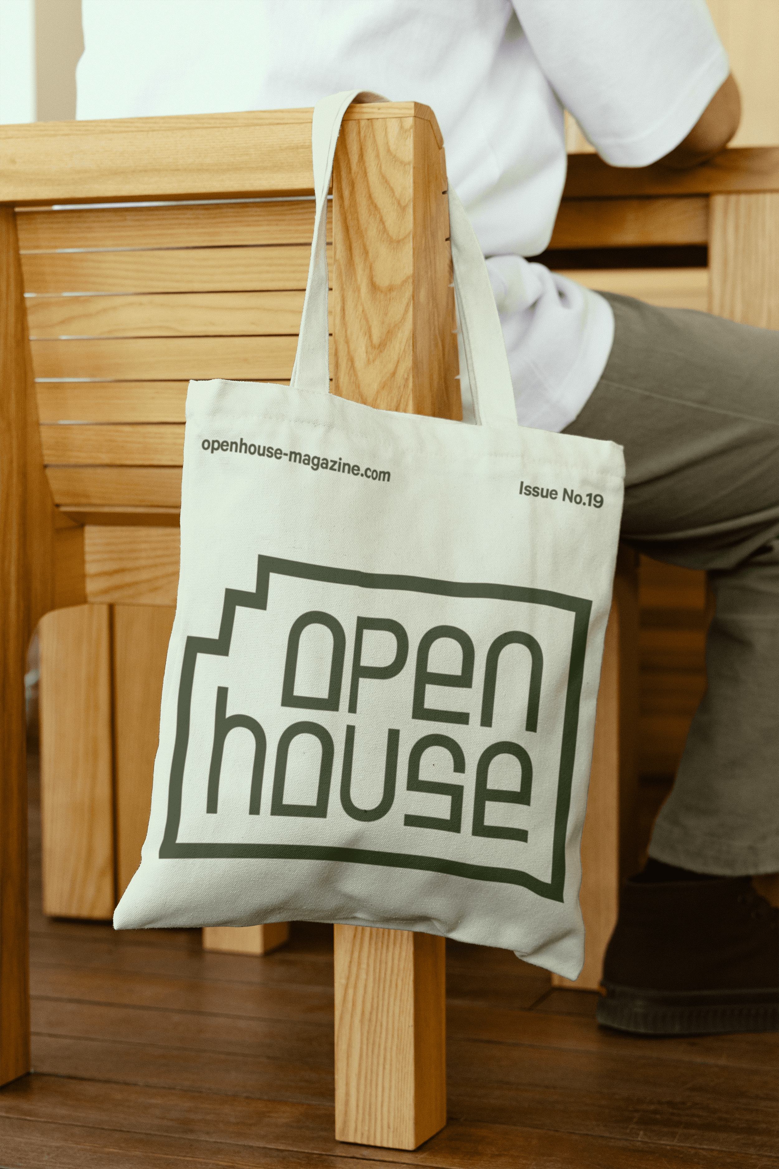
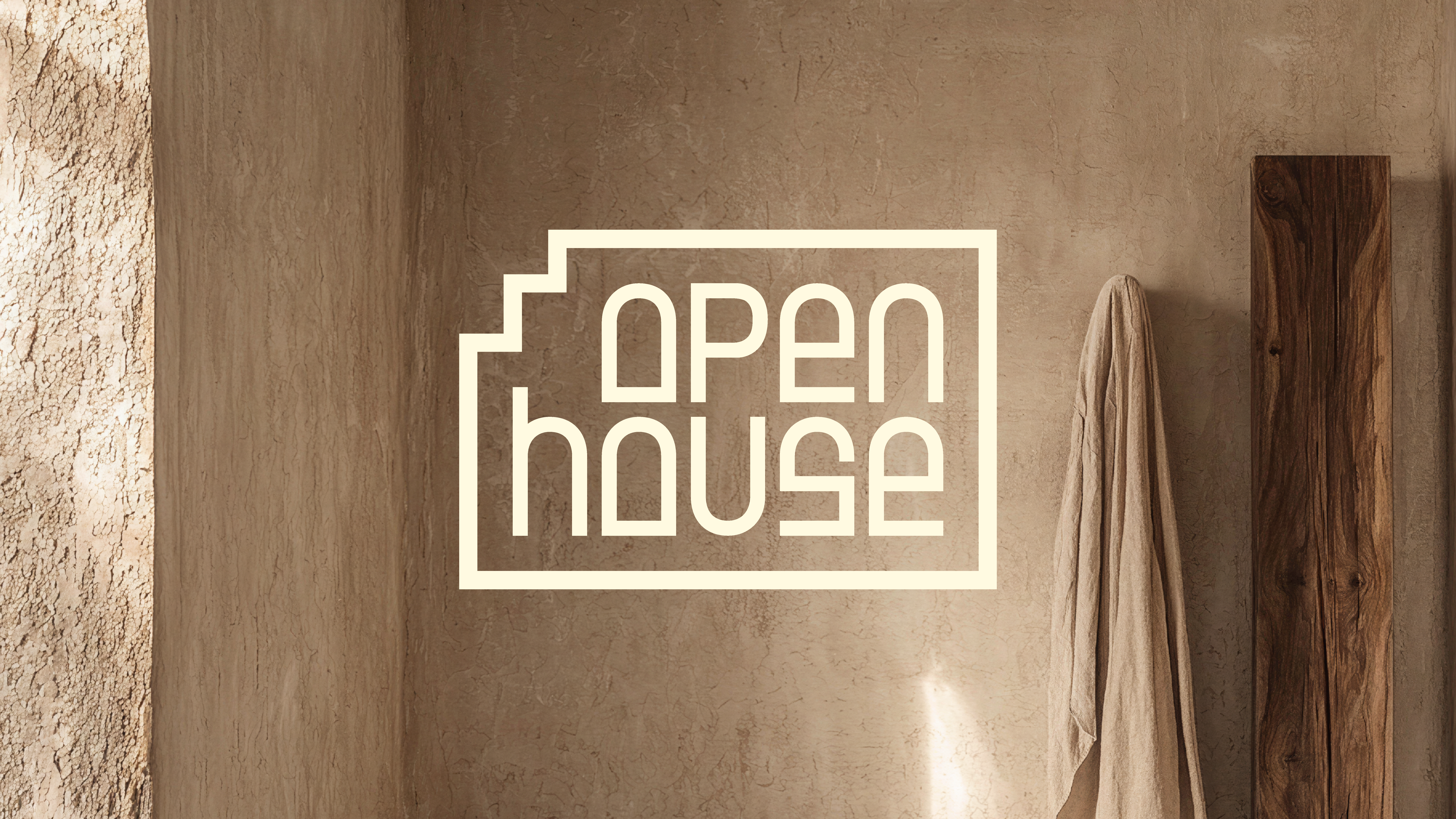
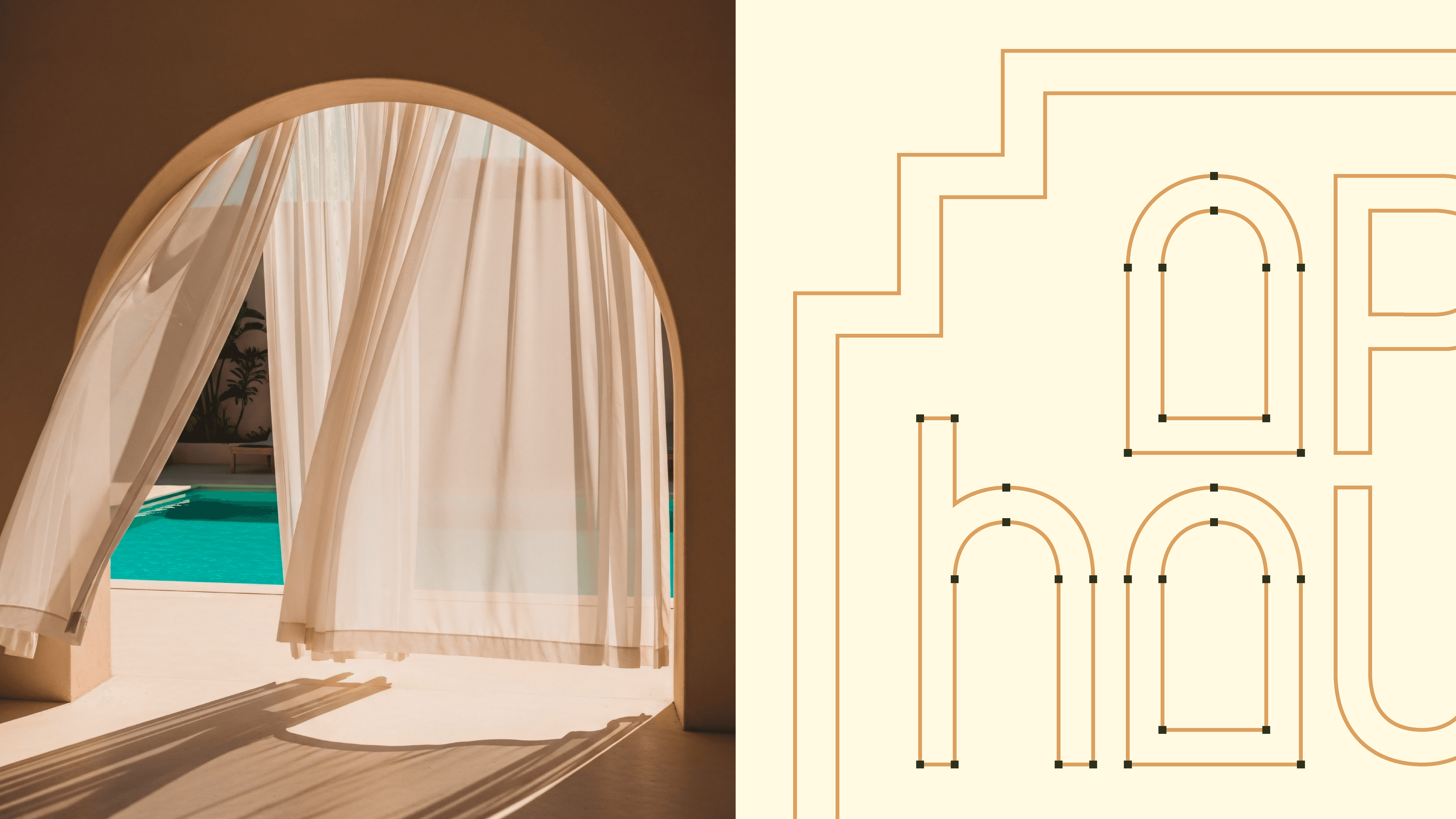
When designing the logo, I studied architectural photography to incorporate elements within the facades of buildings, their form, and the space they invite. A recurring design structure in my research were arched windows. Taking that arched angle, I created a custom logotype that harnessed the arched characteristic within the letterforms, resembling the side portrait of a building. Additionally, to balance the negative space with the ascender of the lowercase h, I housed the logotype inside an aerial view of a blueprint schematic reminiscent of architectural drawings.

II.
Design System



III.
Magazine
IV.
Editorial Grid
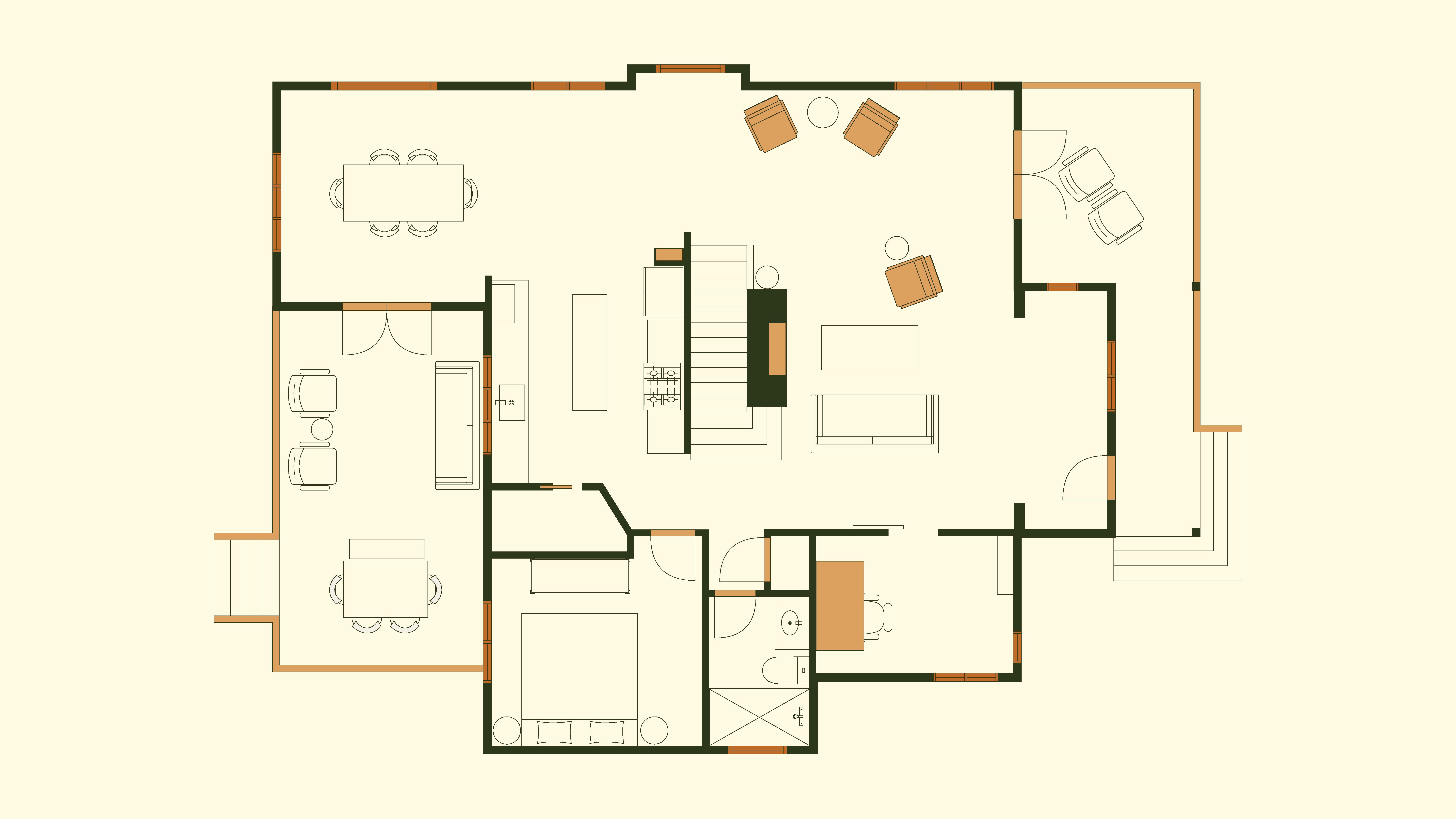
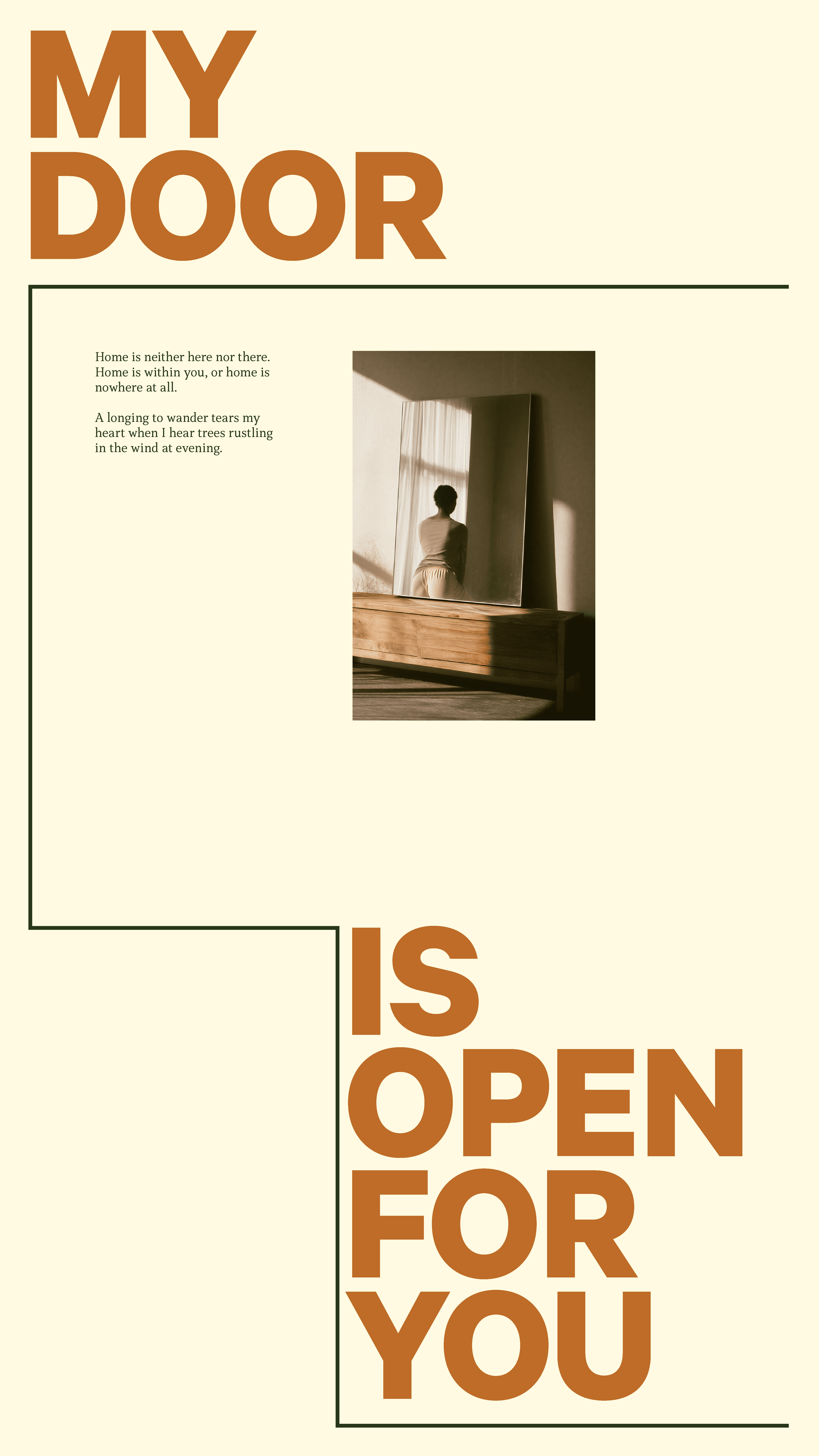
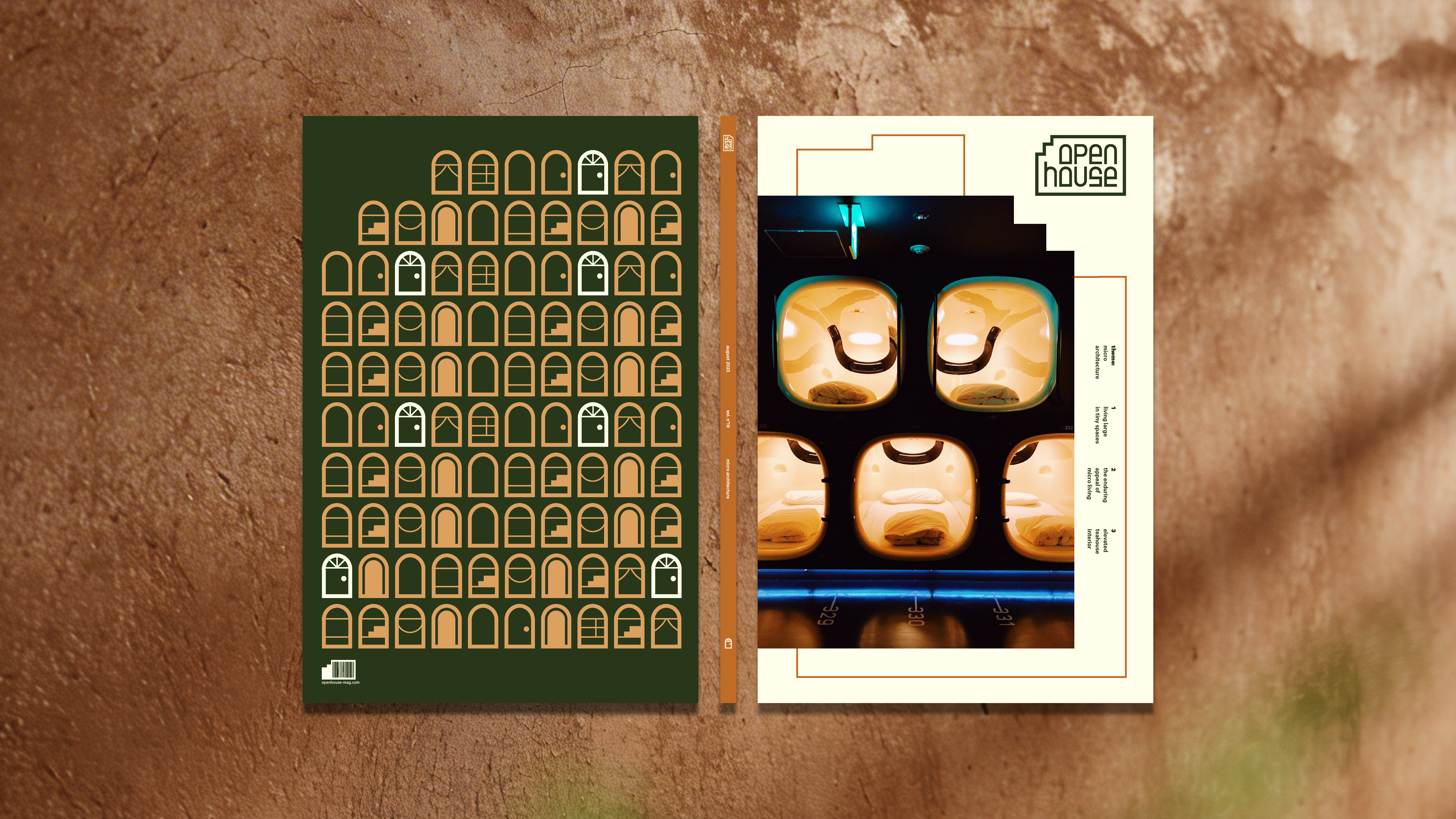
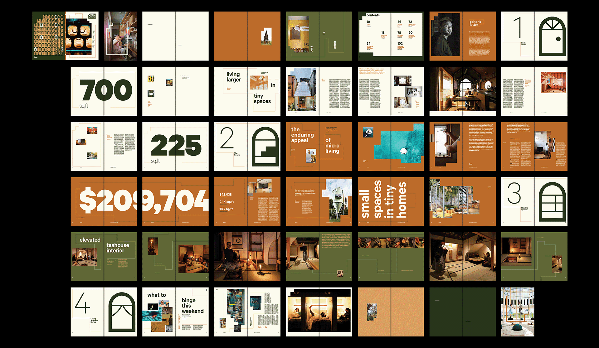
Extending the idea of the blueprint schematic which houses the mark, I saw the editorial grid as an architectural structure in its own right. The grid became more than a skeleton to house typography, but to be treated as infrastructure. I generated throughout the magazine traced blueprint schematics on top of the grid that became either framing devices, image containers, and graphical elements.


V.
Posters
VI.
Applications